Google has started rolling out a new gradient-style icon design across its Workspace apps.
The redesign marks a major visual refresh for Google’s app ecosystem after years of user complaints about the older icons looking too similar.
For users across Southeast Asia, this should make daily apps like Gmail, Google Drive, Docs, Sheets, and Calendar easier to identify at a glance.
Google icons get a cleaner new look
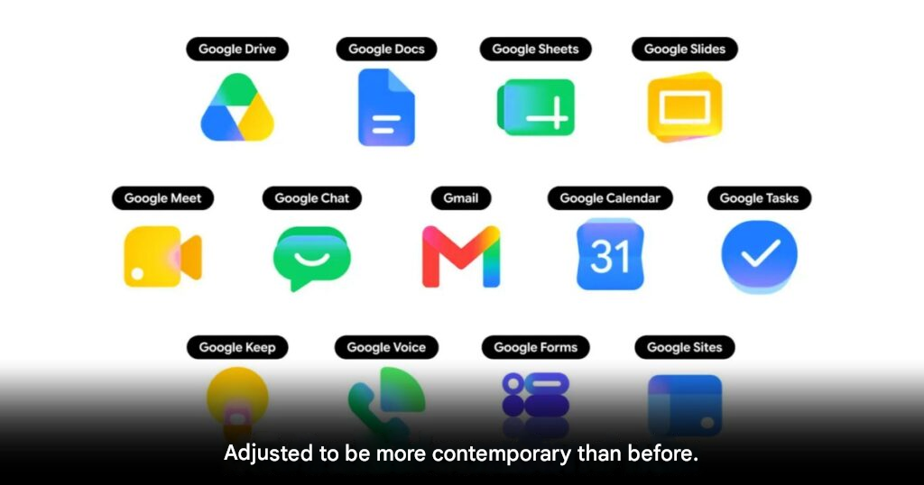
The new icons use gradient colors and more distinct shapes.
Google designed the refresh to make each app easier to recognize.
The older icon set often used the company’s familiar 4-color design across many apps.
While visually consistent, that approach also made several icons harder to tell apart quickly.
Workspace apps are changing first
Users may now start seeing the new icons inside Google’s web app launcher.
This launcher often appears in the upper-right corner of Google websites.
The updated icons can also appear on Chrome’s new tab page.
Google has started applying the new design to several major apps, including Gmail, Google Drive, Docs, Sheets, Slides, Calendar, Chat, Meet, Vids, Forms, Keep, Voice, and Tasks.
Old design rules are being relaxed
The redesign removes some of Google’s older visual restrictions.
Previously, many app icons needed to include all 4 Google brand colors.
That rule has now been relaxed for most apps.
Gmail appears to be one of the few apps still keeping the full 4-color identity.
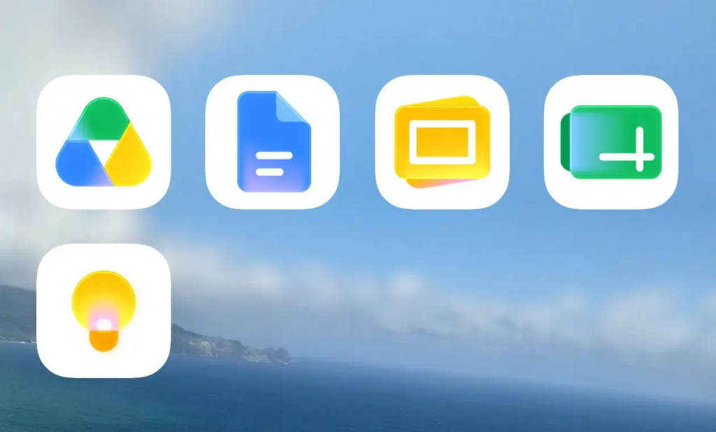
Google has also removed the old document-style square frame from many Workspace icons.
This allows the icon artwork to appear larger and more distinct.
Rollout is happening gradually
The new gradient icons are now appearing across web, Android, and iOS.
However, not every user will see the redesign immediately.
Google is rolling out the update gradually worldwide.
Some areas, browser tabs, favicons, and editing screens may still show the older icons for now.
A small change with daily impact
This update may look cosmetic, but it can still improve everyday use.
Many users switch between Google apps throughout the day.
Clearer icons can reduce confusion, especially for people who work with several Workspace tools at once.
THIS IS our take
Google finally seems to understand that consistency should not come at the cost of clarity. The old icons looked unified, but often too similar. This gradient redesign gives Workspace apps more personality while keeping the Google identity intact.
Origin: 9to5google