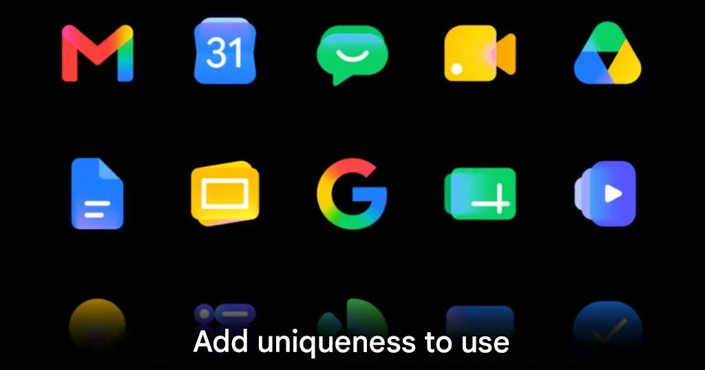
Google has officially introduced a new icon design for its Workspace product family, bringing a brighter and more unified look across several major apps.
The company has been testing a gradient-style color design for more than a year. Now, the updated icons appeared more clearly during the recent Google I/O 2026 developer conference. This confirms that the new visual direction will become part of Google’s wider product identity moving forward.
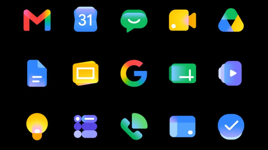
The redesign aims to make Google’s services feel more consistent across different apps while still giving each product a clearer personality. For users who work across laptops, smartphones, and tablets every day, these small visual changes may make the app lineup feel fresher and easier to recognize.
Google updates 14 Workspace app icons
The new icon update covers 14 Google Workspace products. These include Gmail, Calendar, Chat, Meet, Drive, Docs, Slides, Sheets, Vids, Keep, Forms, Voice, Sites, and Tasks.
Google explained that the goal is to create better consistency across the full Workspace ecosystem. At the same time, the company also wants each app to stand out more clearly from the others.
Some icons mainly receive color and tone adjustments so they match the wider design language. Others show more noticeable changes. For example, Google Sheets moves away from the older paper-like design and uses a more abstract icon focused on spreadsheet cells. Meanwhile, Google Meet now uses a brighter yellow tone while keeping its familiar video camera shape, making it easier to recognize at a glance.
The new look may not appear for everyone immediately
Although many users may already notice the updated design, the rollout will not happen for everyone at the same time.
Google said the new icons will arrive through an extended rollout. This means some users may need to wait until June before the full design refresh appears across all their personal devices.
So, if some apps still show their old icons, there is no need to worry. The new visual style should gradually appear as Google continues the rollout across regions, platforms, and devices.
A small change that makes Workspace feel newer
This redesign may look like a minor change at first, but app icons play an important role in daily use. They help users identify tools quickly, especially when switching between work apps throughout the day.
With this new design, Google is giving Workspace a cleaner, brighter, and more modern feel. The updated icons may not change how the apps work, but they help make the overall experience feel more refreshed and visually connected.
Google’s icon redesign is a small but smart move. Workspace users spend hours moving between Gmail, Drive, Docs, Sheets, Meet, and other tools, so clearer visual identity matters more than it may seem. The brighter gradient look also gives the ecosystem a more modern feel without making the apps unfamiliar. It is not a major feature update, but it helps make Google Workspace feel cleaner, fresher, and more unified across devices.
Origin: Androidauthority