YouTube Unveils Cleaner Video Player UI
YouTube Unveils Cleaner Video Player UI
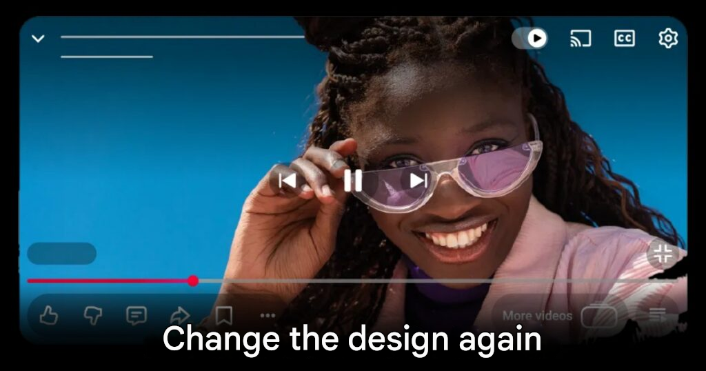
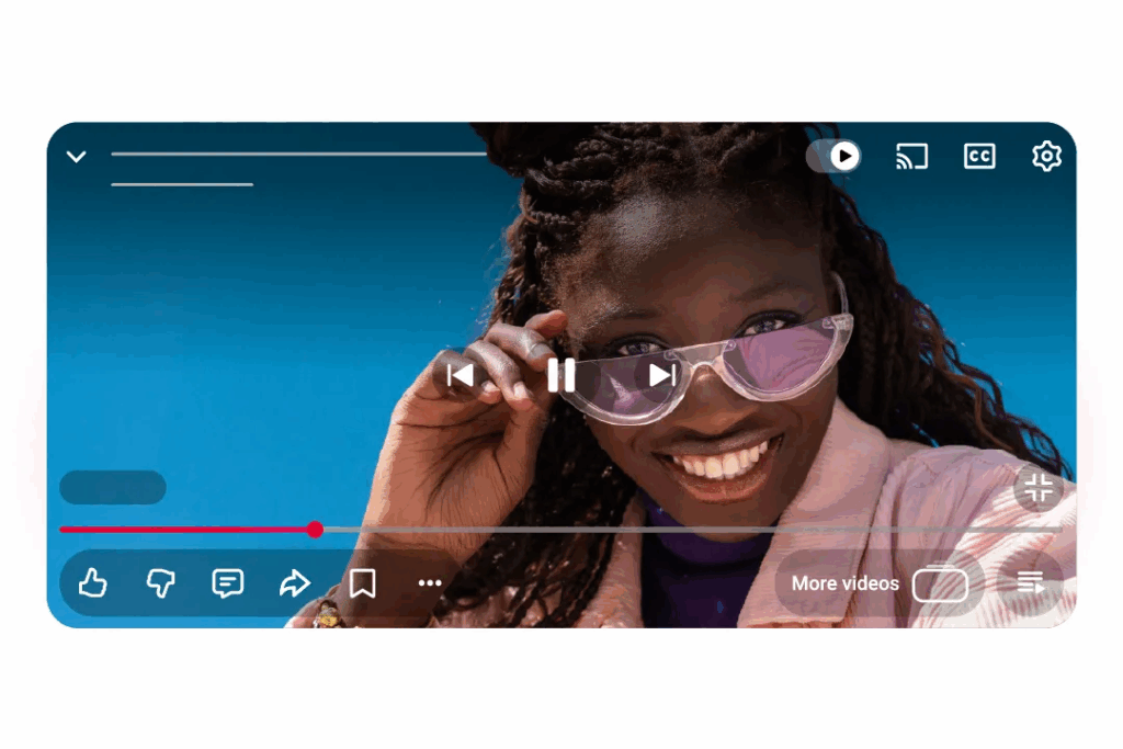
YouTube announces a new video player design to look modern and clean. It will be gradually updated from this week onwards. This change highlights rounded, slightly translucent controls and icons, reducing obscurity of video content while providing a more immersive viewing experience on mobile. Websites and Smart TVs
The new design has been tested on a select group of users since early 2025, with YouTube revealing that the design emphasizes simplicity but modernity. It doesn’t even have the sheen of Apple’s Liquid Glass, but it still feels fresh. The buttons are less distracting to the eyes, allowing you to focus on the video better.
New features included in this update include improvements to the double-tap system for skipping that is smoother and less distracting to watch. Users will be able to skip videos more conveniently without feeling stuttered. YouTube also adds special animations when liking, such as musical notes floating up in music videos. Increase the fun of participation.
The comment reply system has also been improved with a new, more organized structure. Make conversations in the comment box easy to read and follow. This is especially true in long-form interactive videos, which will enhance the YouTube community experience.
This update reflects YouTube’s intention to make watching videos more natural and comfortable. Both in design and functionality. Users around the world will start seeing this change on different platforms within the next few weeks.
YouTube fans are ready to experience this new experience. You can check for updates through the YouTube app or website. It is expected that this will be an important step in elevating the platform to meet the needs of users in the rapidly changing digital era. origin
origin: The Verge